RetireUS
Platform
Client:
RetireUS
Year:
2025
Type:
Web apps
,
Finance
Agency:
Qream Design Agency
Website:
Solution
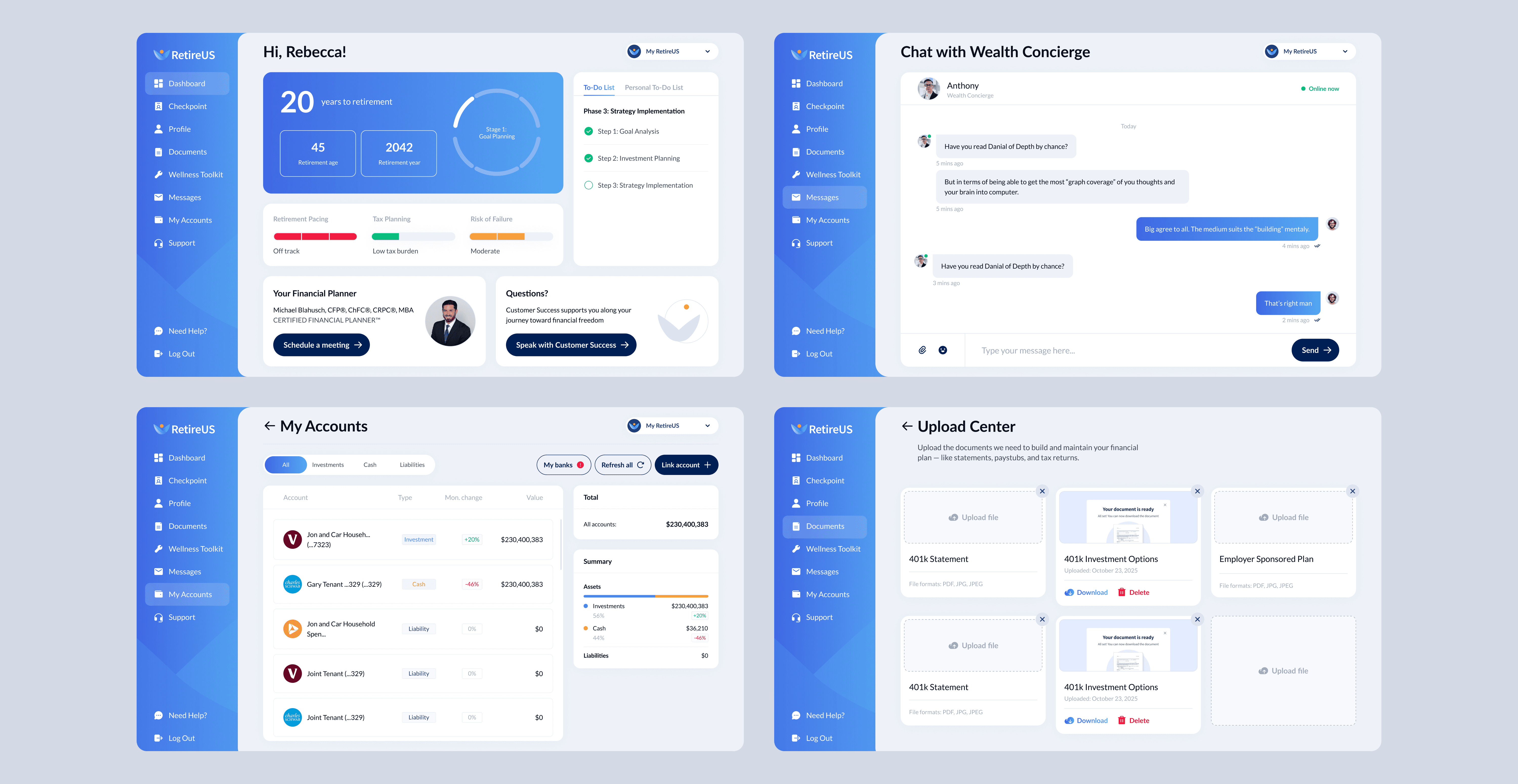
RetireUS is a fintech platform that makes retirement planning simple, engaging, and understandable through its core feature, the Financial Checkpoint dashboard. It transforms complex financial data into clear steps, guided flows, and actionable insights. As a Product Designer, I owned the UX/UI for 4 years, building the SaaS platform, website, and design system from scratch while continuously improving usability and engagement.
Overview
RetireUS combines financial tracking, advisor support, and personalized insights into one ecosystem designed for ongoing use. I worked across the full product lifecycle, from wireframes to launch and iterations, collaborating closely with stakeholders and optimizing the experience for a mobile-dominant audience (76%+ traffic).
Goal
Project Goals:
Make retirement planning clear, accessible, and engaging
Turn complex financial data into actionable insights and steps
Increase user engagement and retention over time
Build a system optimized for a mobile-dominant audience
Maintain a balance between trust (fintech) and approachability (light gamification)
Problem
Retirement planning is often seen as confusing, static, and overwhelming. Most tools either present raw data without guidance or feel too technical for everyday users.
Additionally, users increasingly access fintech products via mobile, requiring clear, simplified flows and strong readability. The challenge was to create a platform that feels structured, intuitive, and motivating, while maintaining credibility and supporting long-term engagement.
Process
Research & Problem Definition
We identified that users don’t just need financial data, they need guidance and clarity on what to do next. This led to designing flows that translate complex financial states into simple steps, questions, and progress indicators.
Competitive Analysis
We analyzed fintech dashboards and retirement tools. Most lacked engagement and continuity, often functioning as static reports rather than interactive systems. This revealed an opportunity to introduce progress-driven and gamified elements.
Design Approach
The platform was built and continuously improved over multiple iterations:
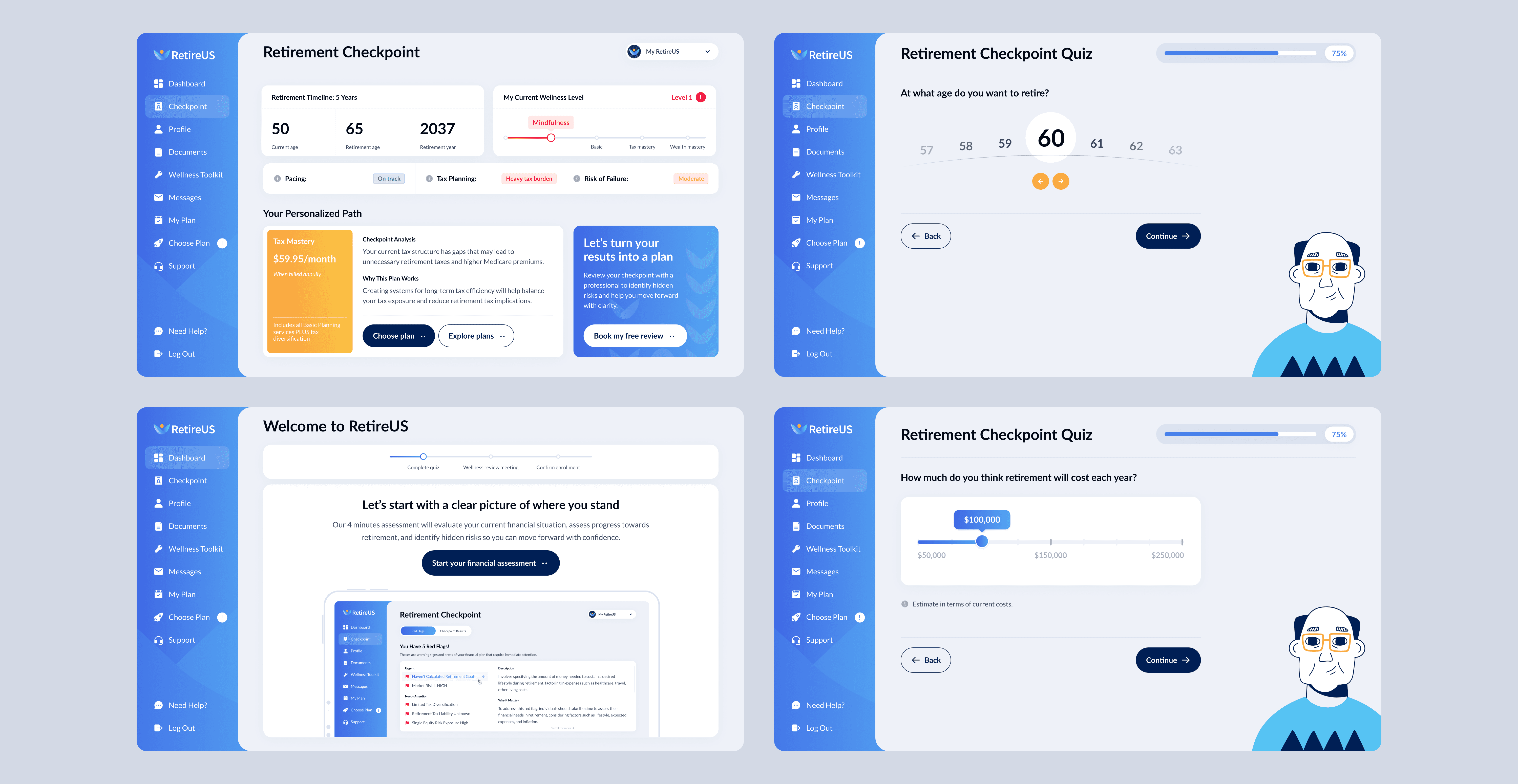
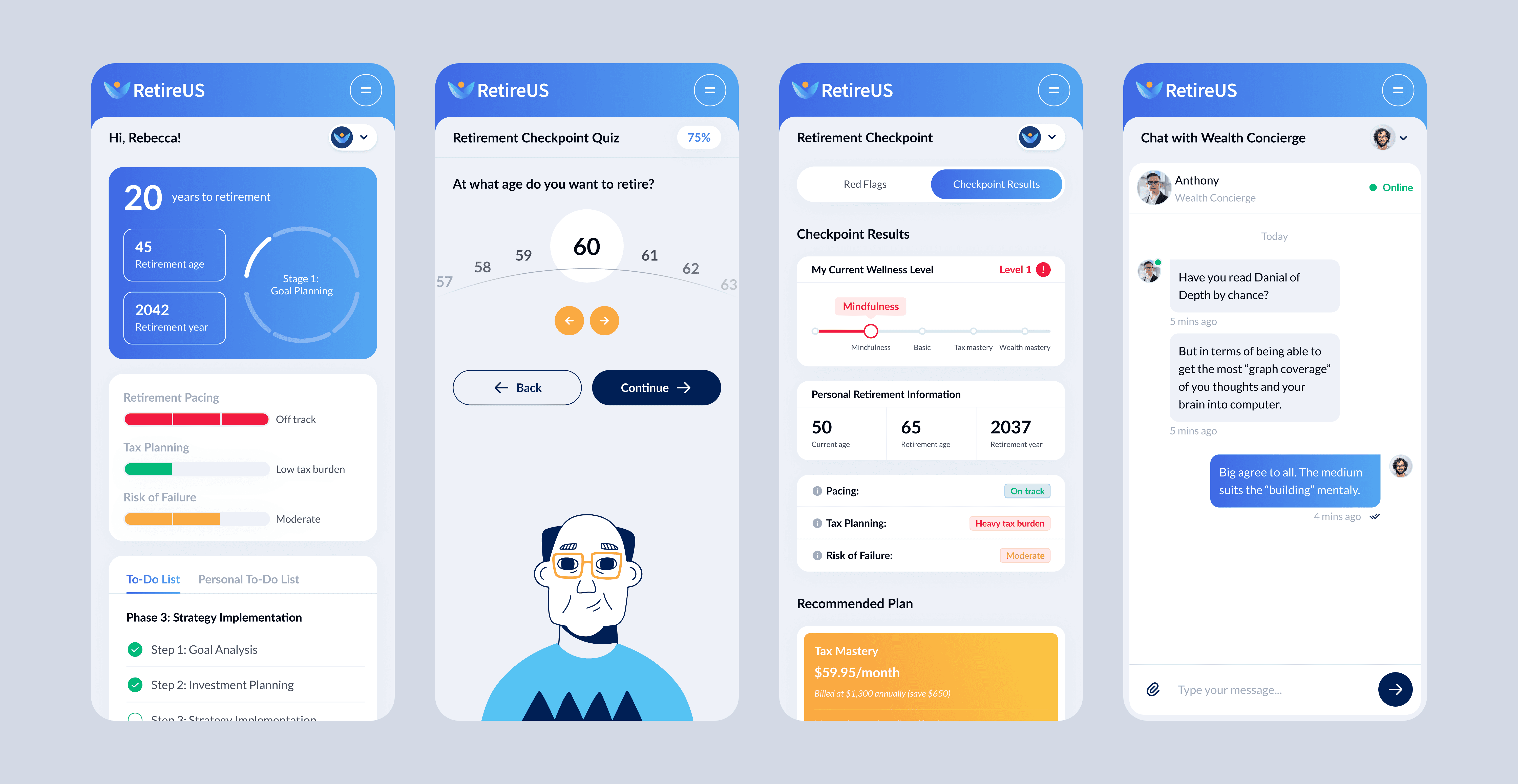
Financial Checkpoint dashboard as the central experience
Gamification mechanics (quizzes, wellness scores, progress states)
Large, readable typography tailored for a mature audience
Simplified data visualization to reduce cognitive load
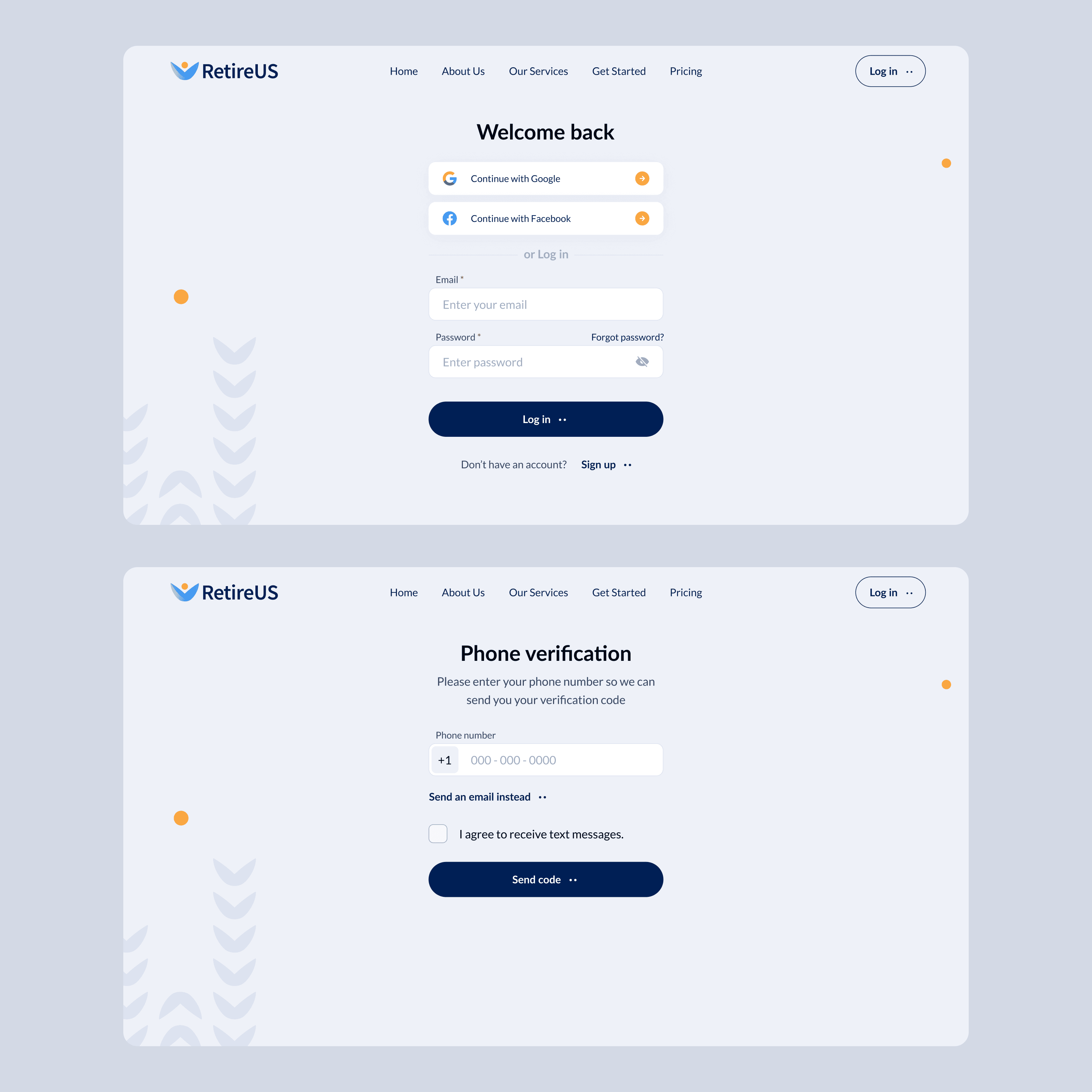
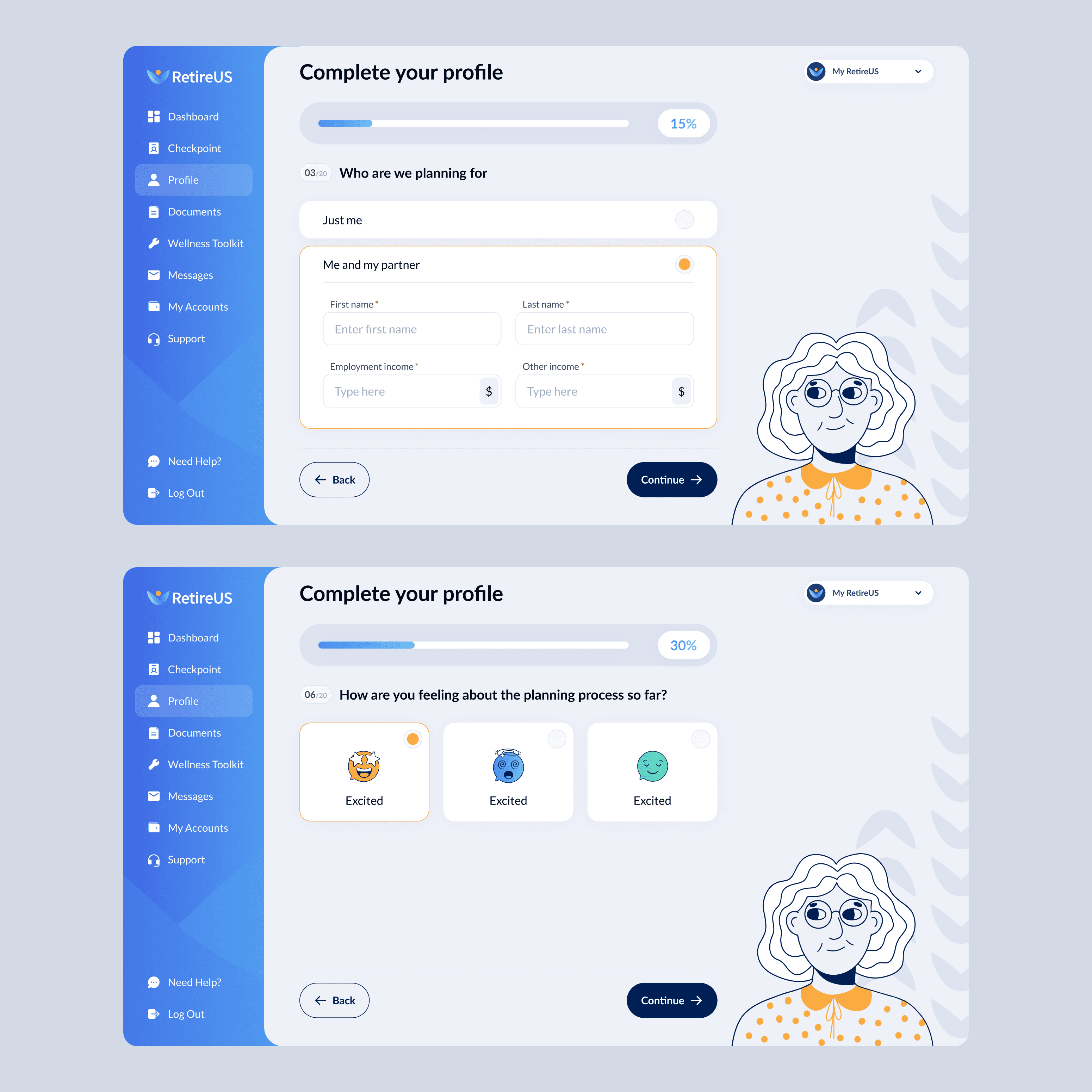
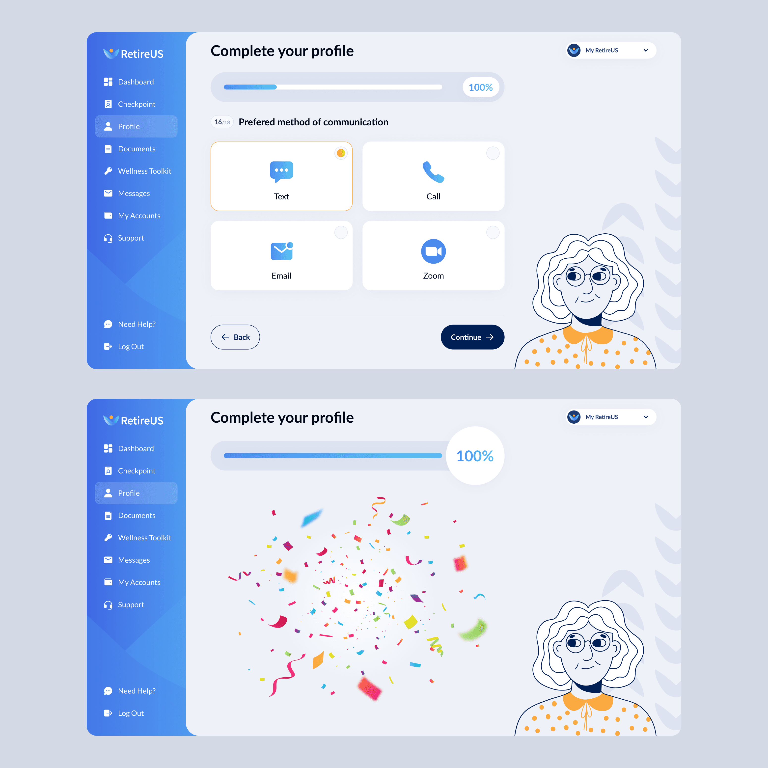
Step-by-step onboarding and goal tracking flows
External account integrations for real-time financial overview
Fully responsive system optimized for mobile-first usage
Key features implemented
Financial Checkpoint (financial health, risks, actionable insights)
Advisor connection with unlimited chat
Bank account linking and debt tracking
Goal planning and progress monitoring
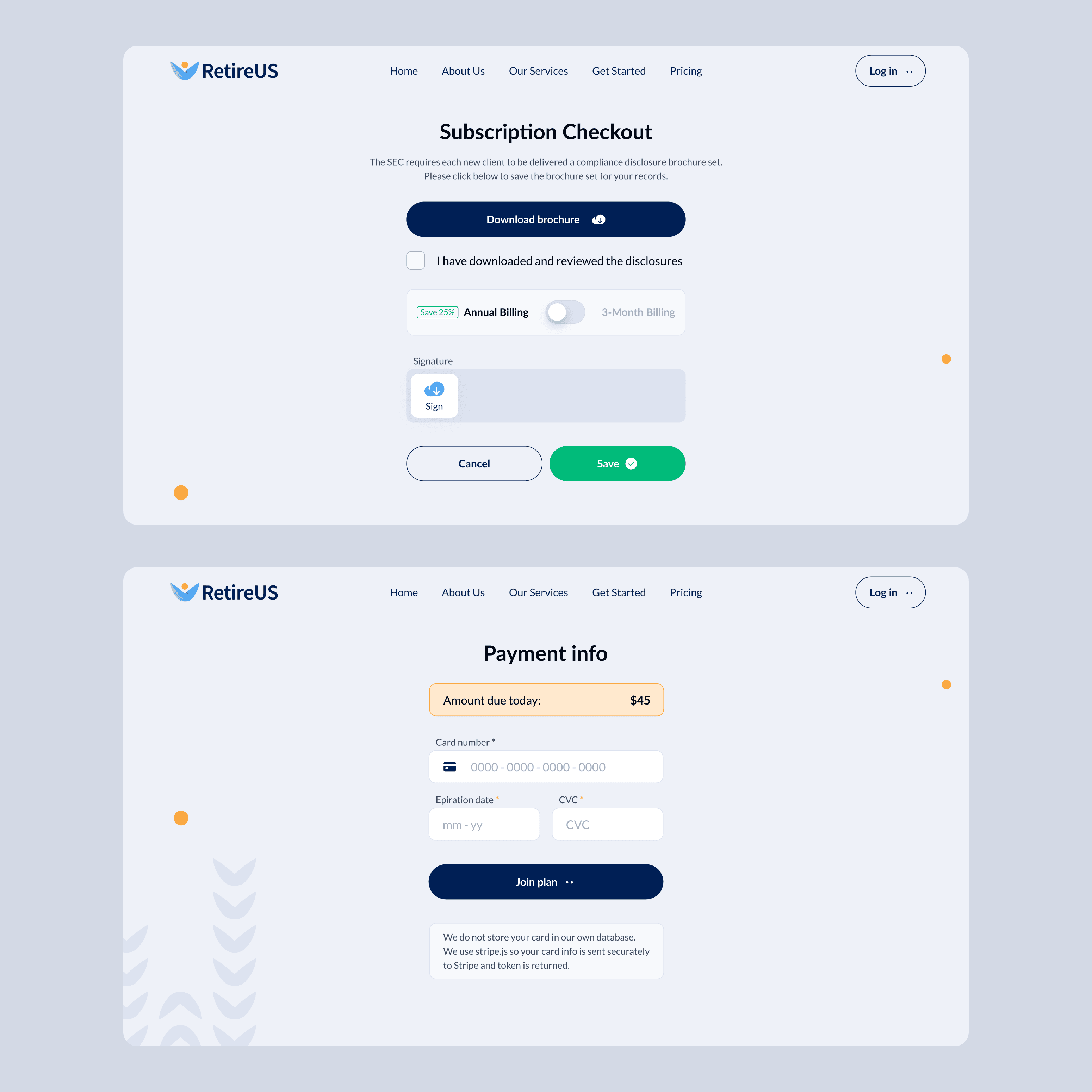
Onboarding and payment flows
Gamified engagement elements across product and website
Reflection
RetireUS transformed retirement planning into a clear, interactive, and user-driven experience. By focusing on guidance instead of raw data, the platform helps users confidently understand and improve their financial future.
Over 4 years, my work contributed to measurable product growth:
+22% month-over-month traffic growth
Designed for a mobile-dominant audience (76%+ mobile traffic)
Improved onboarding and user flows, increasing overall engagement
This project highlights how thoughtful UX and continuous iteration can turn a traditionally complex domain into a scalable, engaging fintech product that users return to regularly.
Product design made us look dramatically different and much more user-friendly